The streamlined interface and functionality in Smart Discover makes building visualizations a simple and fast process.
Important: A discovery that is built in Smart Discover is not a special type of discovery. Other users who do not have access to Smart Discover will be able to open and edit the shared discoveries that were created in Smart Discover using Discover Lite or Discover Pro.
Building a Discovery
- Select a measure or custom measure from the Values panel. Once the first measure is selected, it will be displayed in a visualization.
- Select a hierarchy from the Dimensions panel to display qualitative data in the visualization.
- Select a hierarchy from the Filter panel to filter the discovery by the desired element.
From this point, you can easily define the query further, by adding more measures, hierarchies, and filters. You can also change the visualization type as required.
Advanced Selections
Filtering Hierarchies in Discovery
Custom Selections
While you may want to add an entire hierarchy to your visual, you may also want to add only some of the elements contained in the hierarchy. In this latter case, you can create a custom selection.
Filter Selections
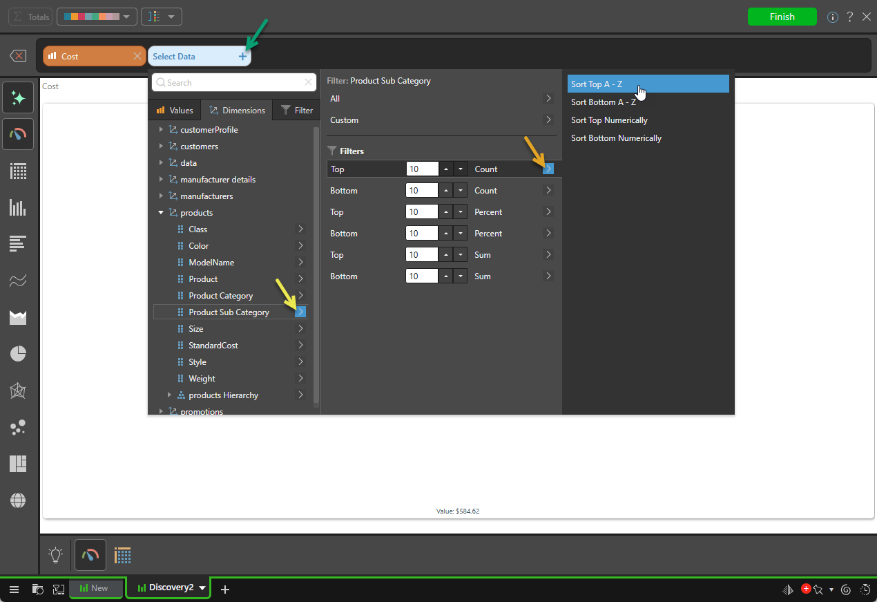
Another alternative to adding an entire hierarchy is to filter the hierarchy by a given value; elements in the hierarchy that don't meet the selected criteria will not be shown in the visual. This allows you to add, for example:
- The top 25% of products, rather than every product sold.
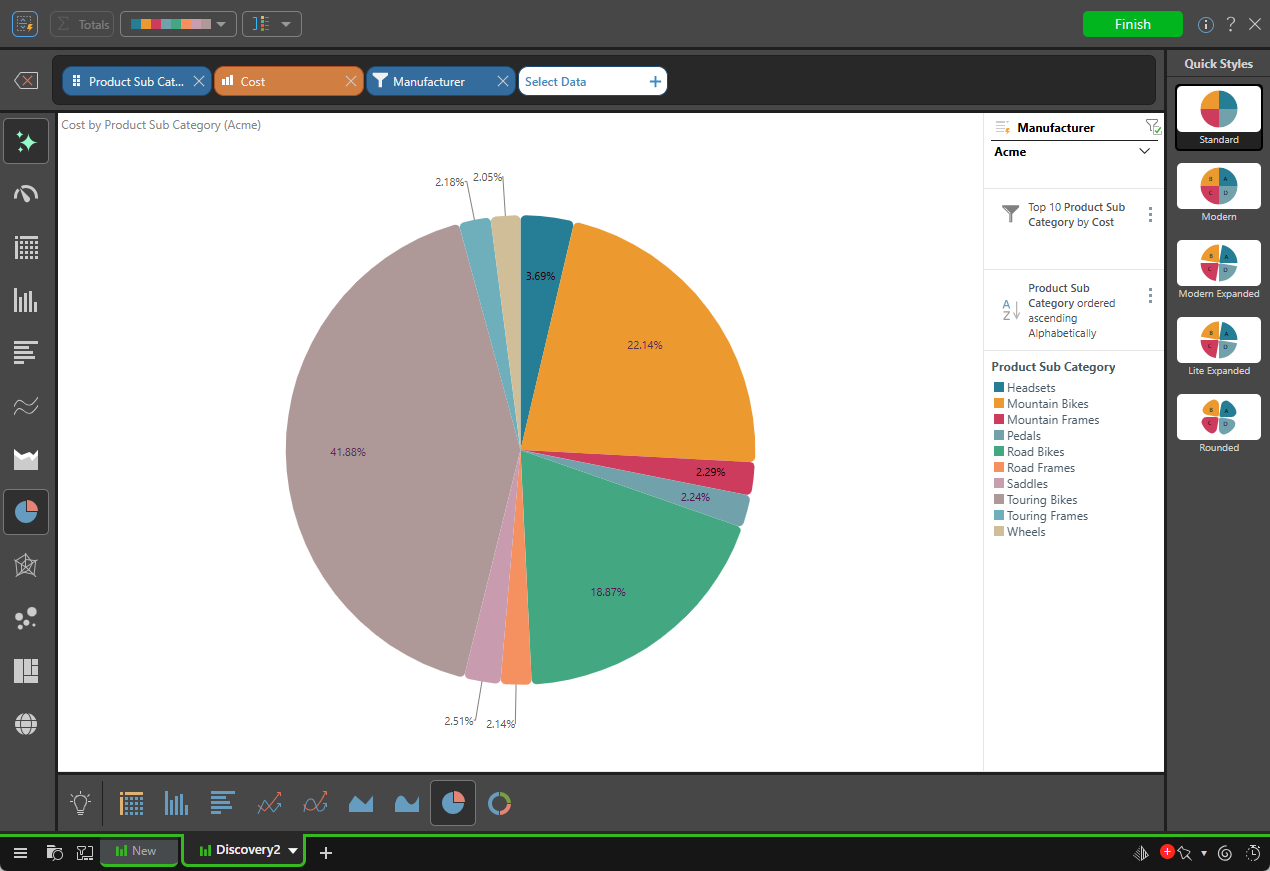
- The top 10 product sub categories, sorted alphabetically (example below). This sorting option allows you to define how the hierarchy's elements should be displayed. For example, should they be displayed in alphabetical order or should they be sorted by value, from highest to lowest?
By sorting and filtering hierarchies, you can tailor your visualization to display the exact information that you're looking for.
Date Selections
Leverage the date selection options to add time periods to the visualization, without making complex selections:

Adding Data Filters
You can select additional hierarchies to use as data filters in the visualization; data filters generate a slicer or a background filter and add it to the visualization (this is different from the preceding filtered hierarchy selections where the filtered hierarchy elements are added to the visualization). Selecting an element from the slicer filters the visualization by the selection on the fly.